 Turkey (Türkçe)
 Worldwide (English)
 0850 123 45 67
 info@example.com
 Sign In
 Sign Up
 Basket (0)
Clear
We make complex ideas easier to understand.
 30% Discount on Annual Hosting Packages + Free Web Performance Package!
An identity connecting ideas to the digital world. Explore the marks, colours and words that make us Overmift.
Download the logo kit ↓Presentation in motion · original artwork unchanged
Move your pointer over the emblem. On touch screens, the presentation moves gently.
Overmift brings together domains, web hosting, virtual servers and business communication services. From giving an idea a place online to developing a digital project, we offer tools that fit the need.
We make complex ideas easier to understand.
We maintain one identity across every touchpoint.
We make room for new ideas and digital possibilities.
The open circle suggests continuity and an evolving digital world. The arrow-like centre points forward: a clear direction within an open field. These are visual associations, rather than a claim about the logo’s historical origin.
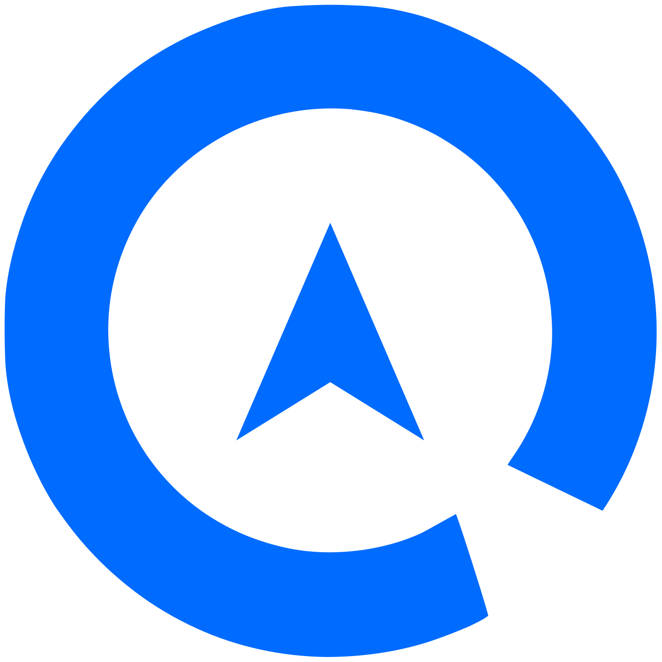
A recognisable silhouette with room for movement.
An upward-pointing form that evokes progress and focus.
The compact symbol and extended wordmark adapt the same identity to different spaces.
Our visual concept combines geometric forms, a confident blue, deep navy and warm yellow accents. Neuropolitical provides a technological character; Montserrat makes communication readable and approachable. Motion adds depth to presentations, while the supplied master logos stay flat and unchanged.
Our symbol and wordmark express the same brand. Choose the right version for the background and preserve the original proportions and files.





The energy of blue, the depth of navy and the warmth of yellow. These codes come from the original logo files shared here.
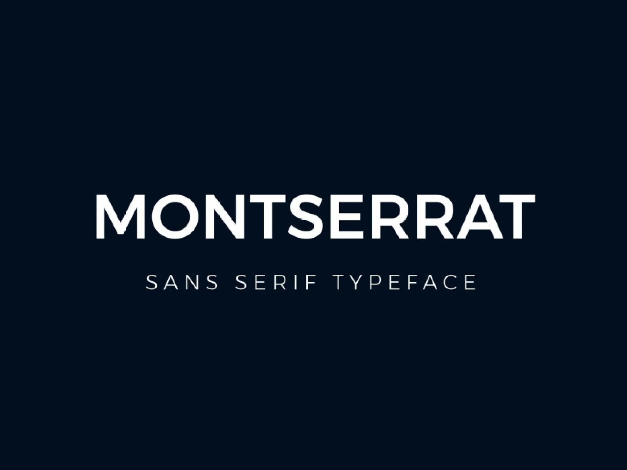
Montserrat is the readable face of our communication. Neuropolitical brings a technological character to our brand identity.
A clear, readable rhythm for headings, descriptions and digital interfaces.
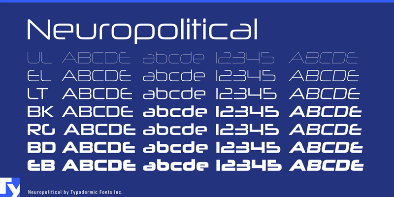
Distinctive, technology-inspired letterforms. Use the original logo file rather than retyping the wordmark.
These images are typography specimens, not font files. Check the relevant licence terms before using a font.
Do not stretch, compress or rotate the logo.
Leave enough clear space to separate the logo from surrounding content.
Choose white on dark backgrounds and blue or navy on light backgrounds.
Do not add shadows, outlines or new colours. Use the supplied artwork.
Another expression of our identity. Watch our brand film.
Download the original logo files in one kit for presentations, promotional work and digital projects.
Download the logo kit ↓